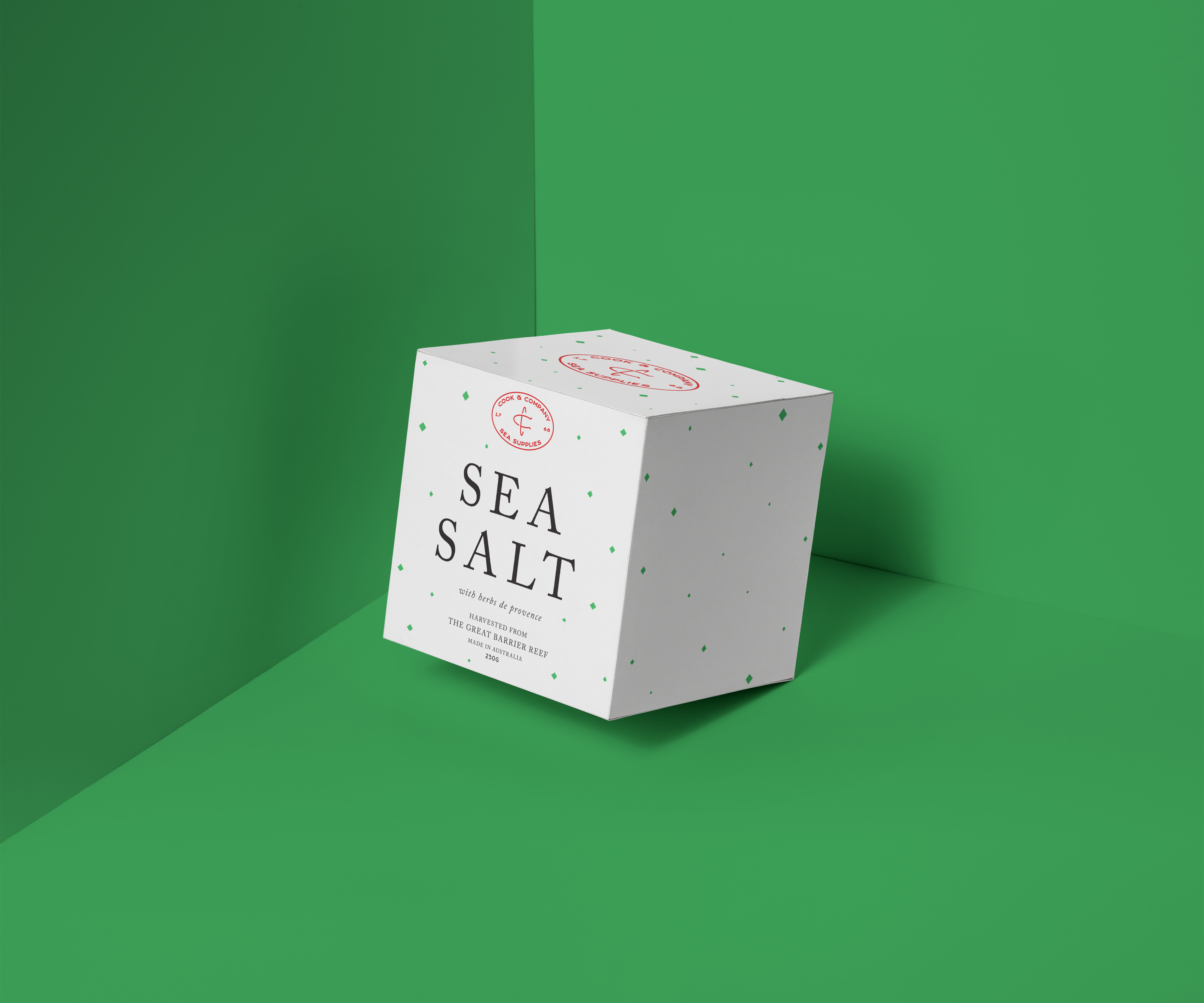
Cook & Company Sea Salt
Awarded with 2019 Adobe DesignAchievement Award—Top Talent
Academic Assignment, Packaging,
Branding, Printed Matter, Typography
2019
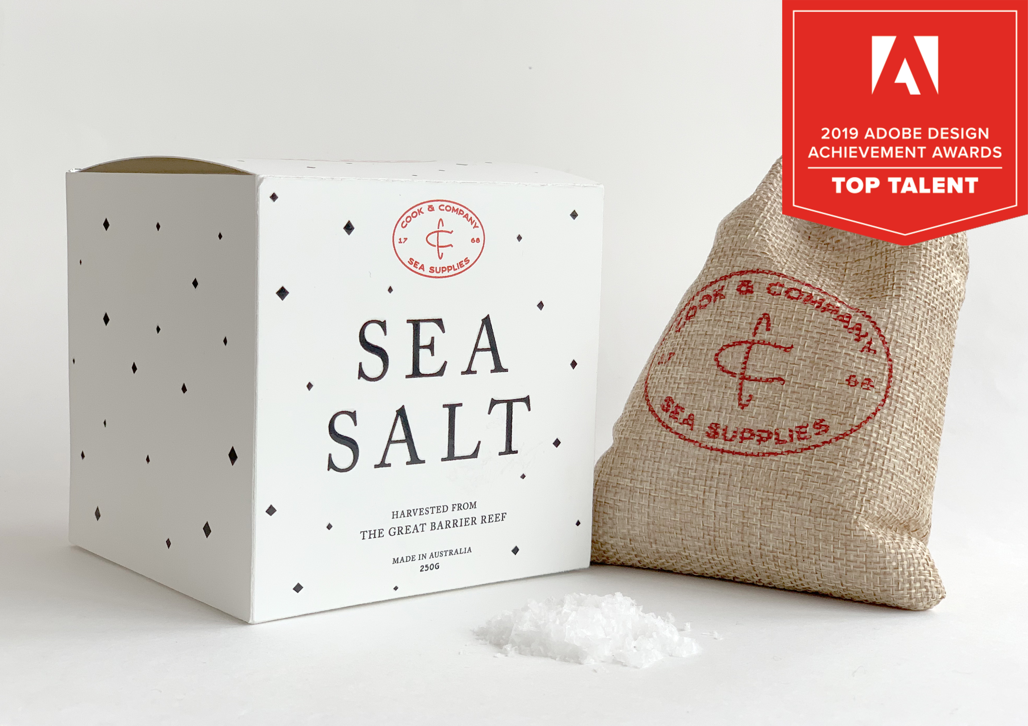
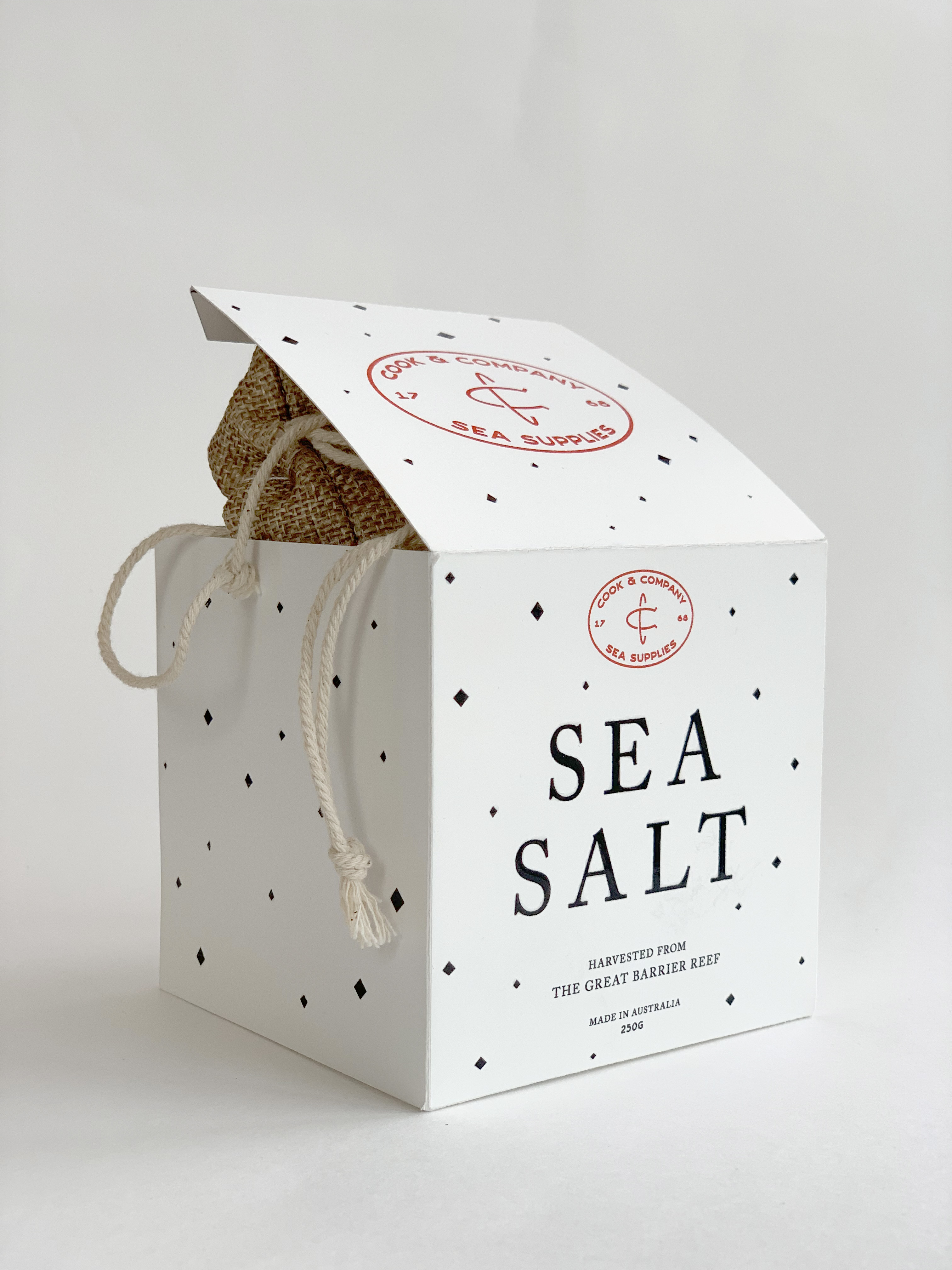
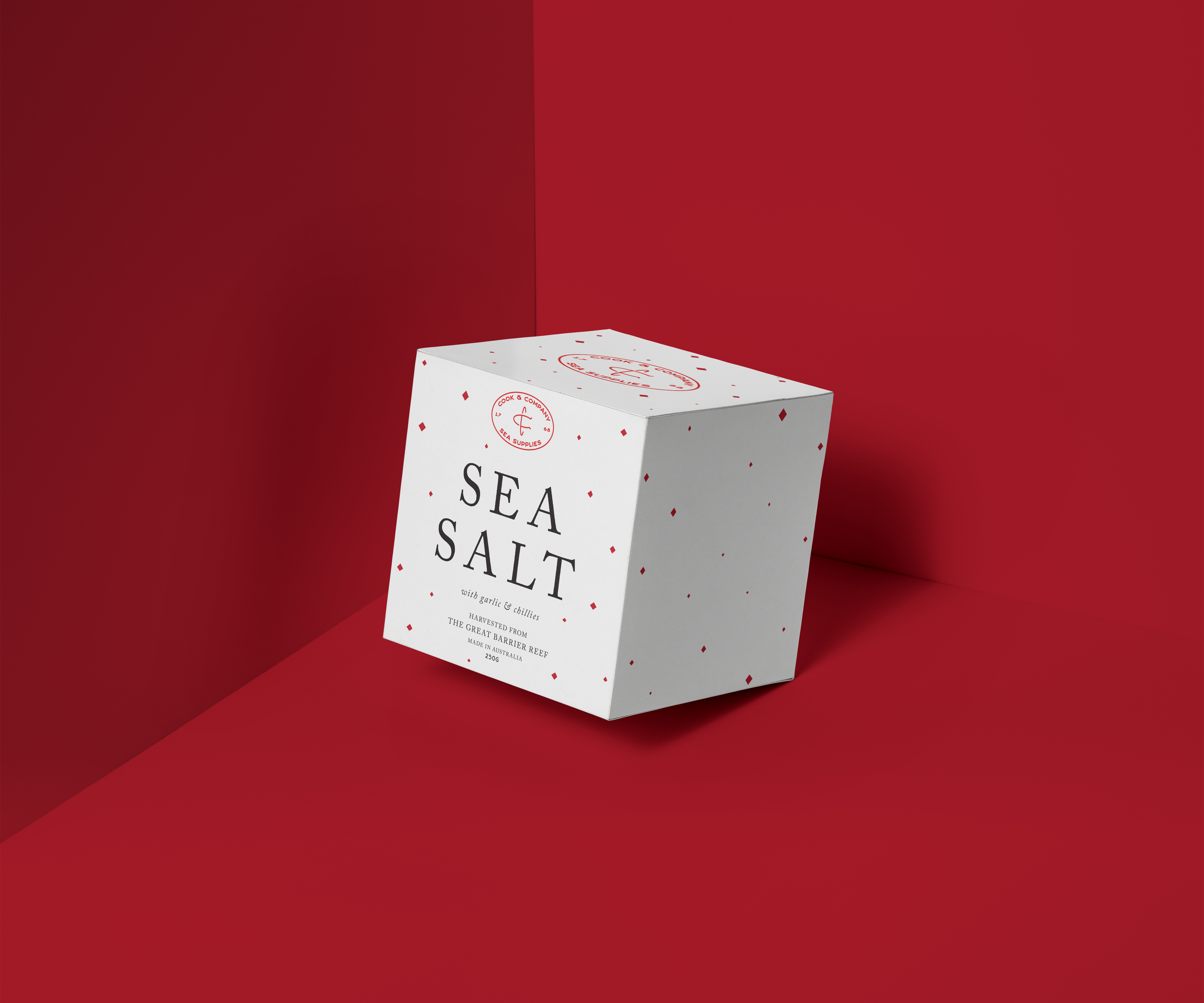
The brief was to design a unique packaging for sea salt harvested from the Great Barrier Reef that would differentiate itself on the shelves. The packaging is a modern approach to a traditional style, drawing visual cues from 1760s typography; be it typography or
visual language.
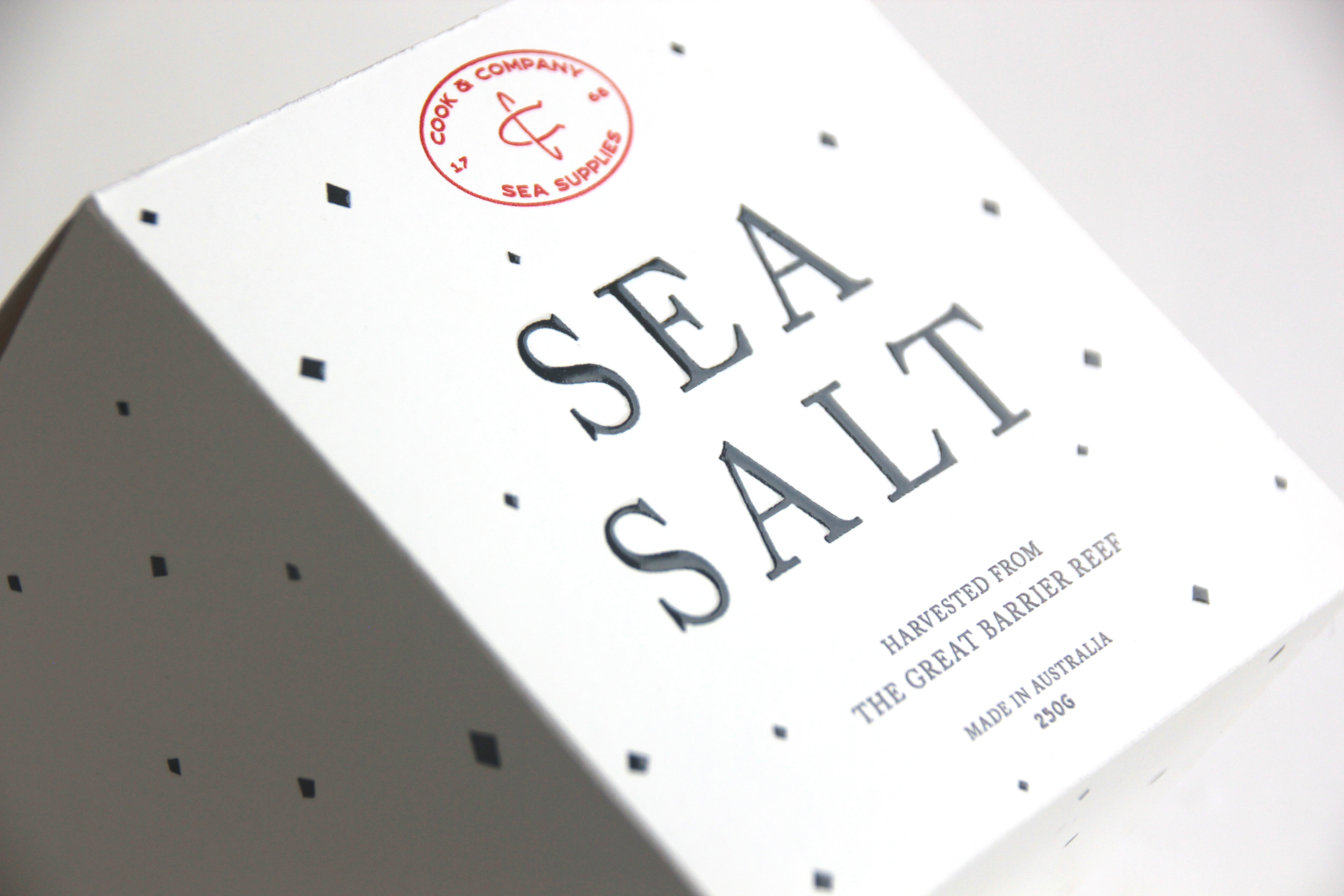
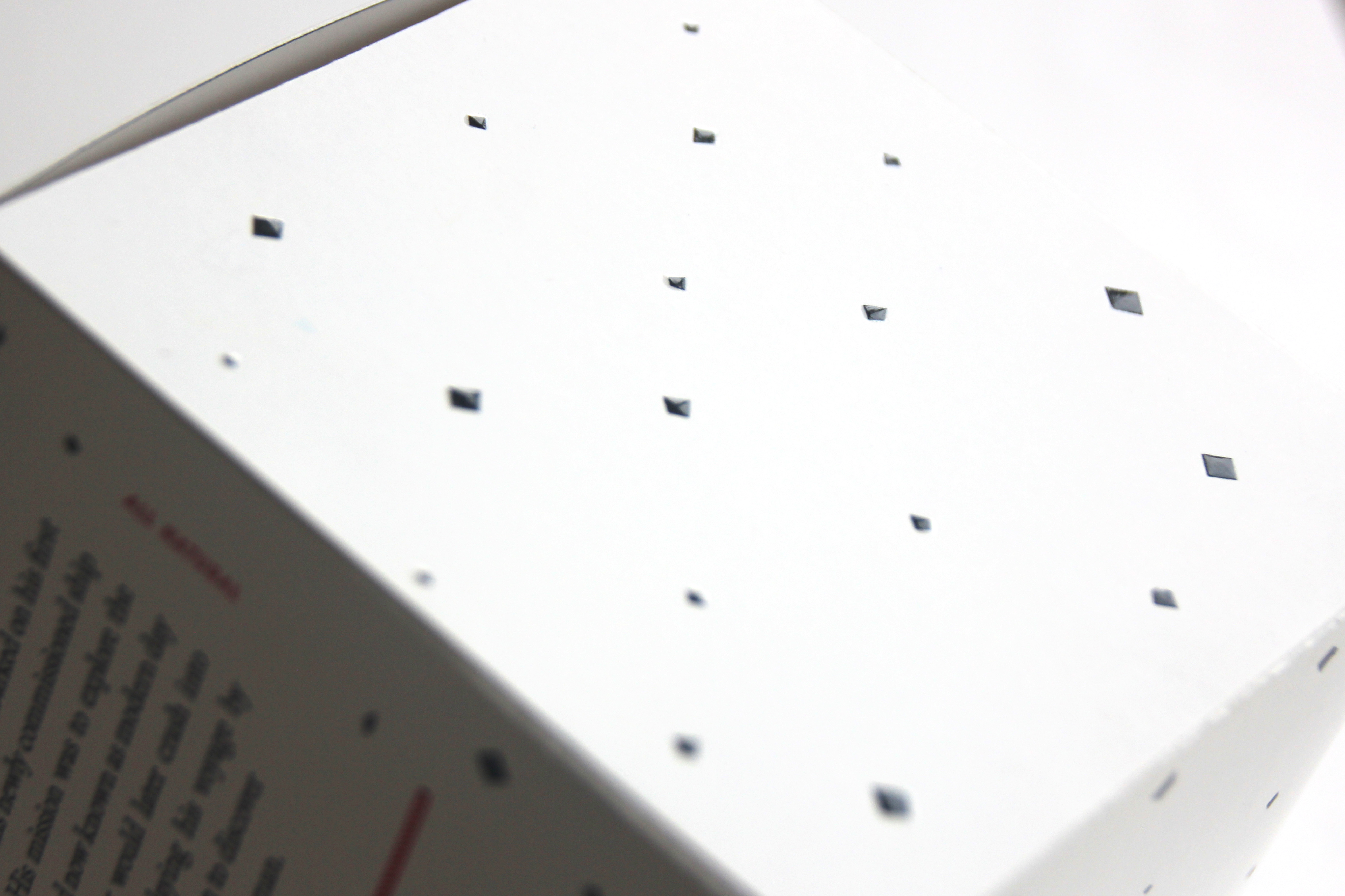
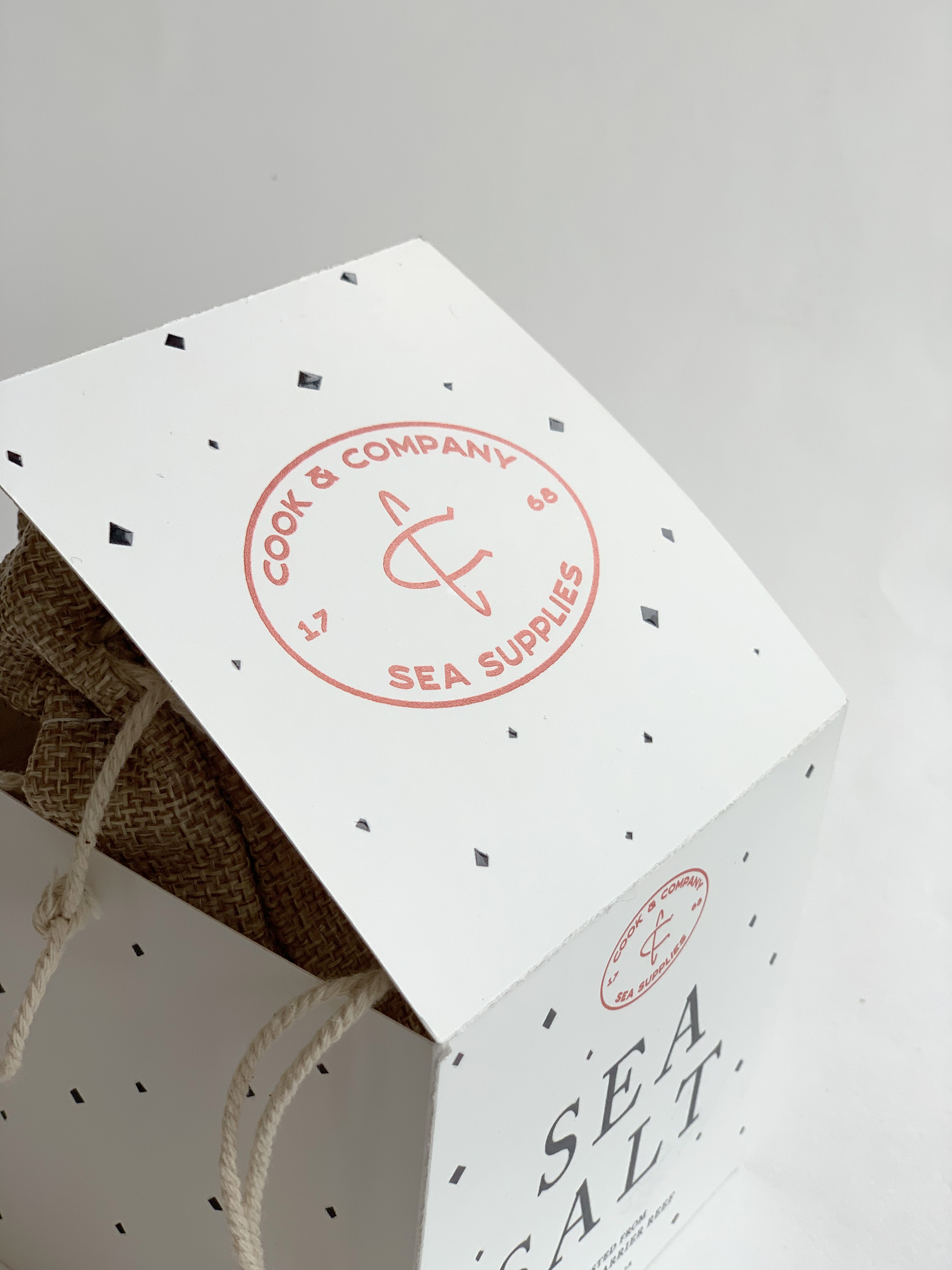
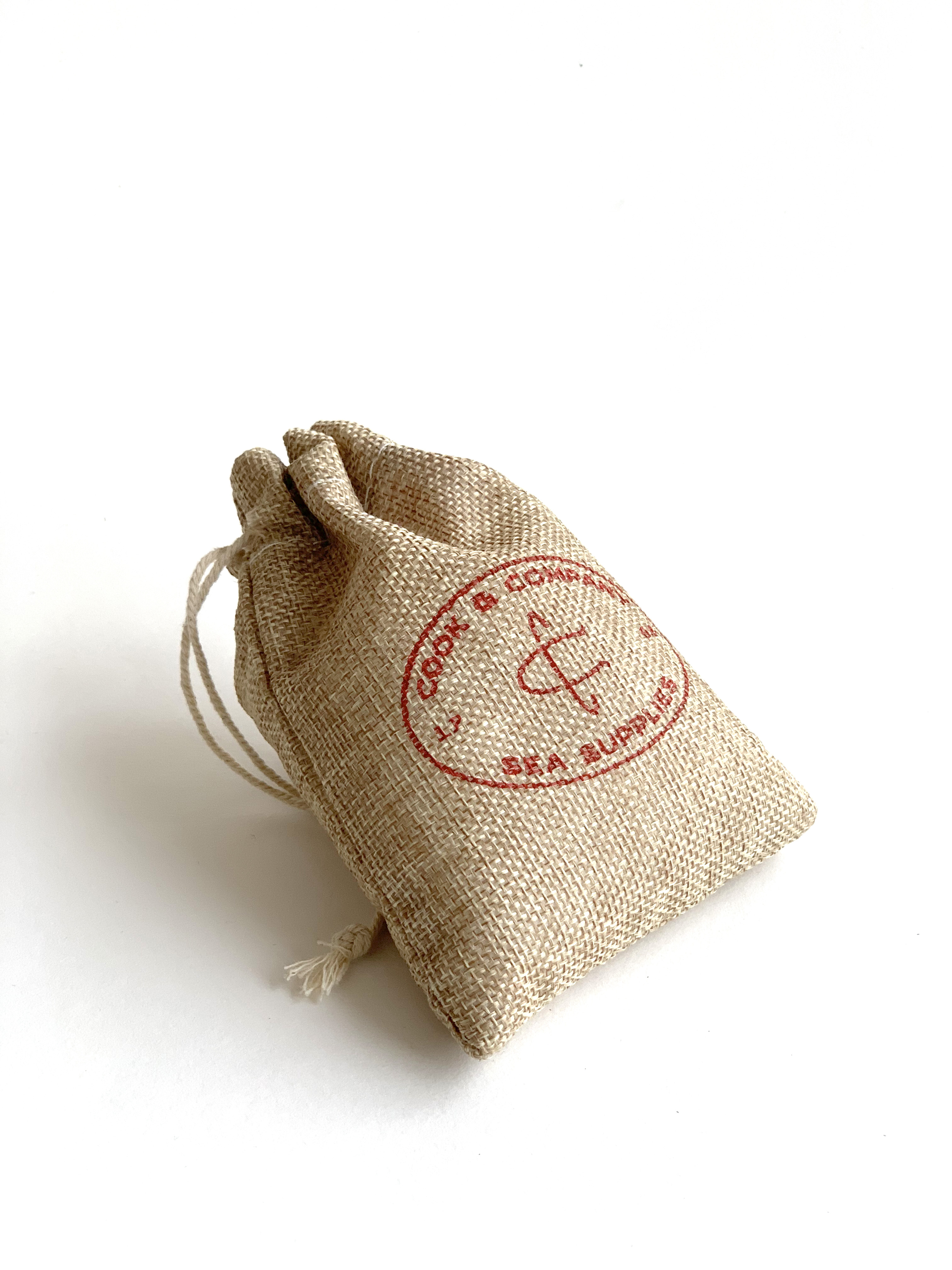
The black specks represent the flaky nature of sea salt and are raised from the surface of the packaging through the use of spot UV to provide a tactile experience for the consumer. The packaging is made out of recycled stock and the inner pouch allows for reusability.
